When ordering custom branded clothing, there’s a whole range of creative choices you have to make—one of which being logo placement.
Where on the garment do you put your design?
Whether an unembellished brand logo or an intricate piece of artwork, its positioning on your uniform or merch is crucial to the impact your clothing can have.
Do you go for subtlety or boldness? Follow conventions or break the mould? It may seem like a small detail, but the placement of your design carries more weight than you might think.
So, to help you with this decision, we’re going to break down the standard positions available in our customisation tool, as well as their most common uses and the reasoning behind them.
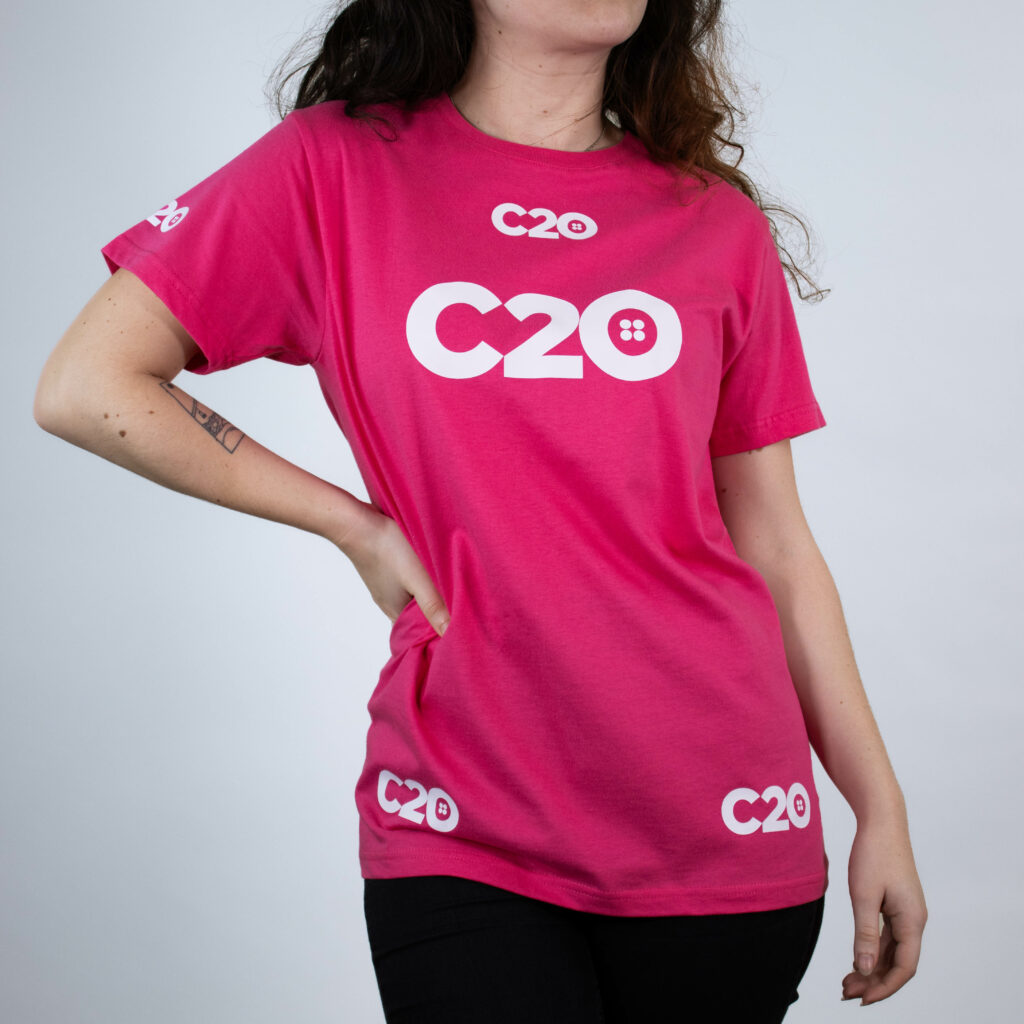
Please note: As t-shirts are our most commonly ordered item, we’ll be using them to demonstrate how each logo placement might look when worn, but these positions may vary slightly for our less-standard items.
FRONT OF GARMENT
Right & Left Chest Logo Placements
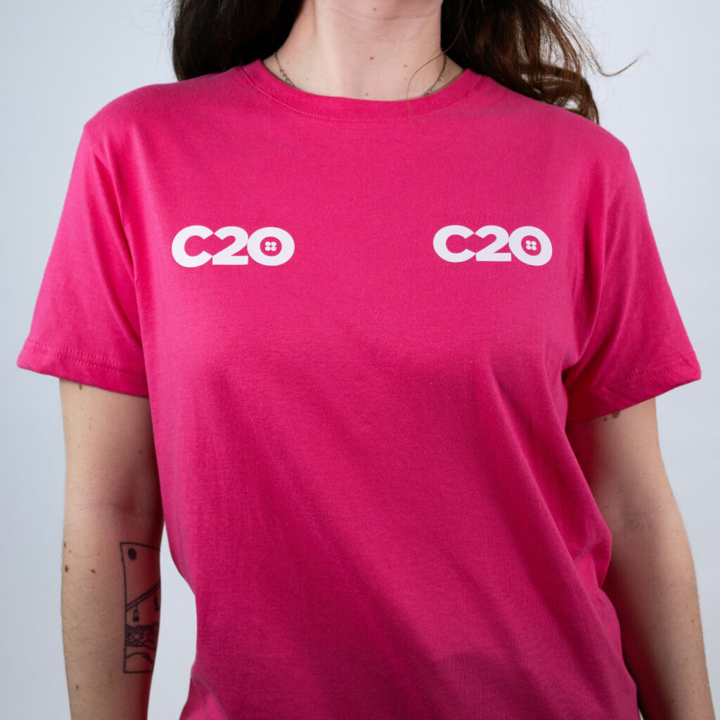
When it comes to branded workwear, left chest is certainly our most popular placement. This is most likely due to the universal nature of the position, as it works for almost every garment type and is therefore adaptable to a whole range of uniform and workwear items.
In addition to t-shirts, hoodies, and sweatshirts, right and left chest are compatible with items like zipped hoodies, jackets, and gilets. So, if you want your logo to be consistent across your entire collection, either of these placements will help create a harmonious and recognisable visual identity for your brand.
In terms of the left side being more common than the right, this is simply due to convention; it’s seen as standard and therefore tends to look more professional. But if you wish to stand out from the rest, you may want to consider the right side, instead.
Top Tip: Applications on the left or right side of the chest should be no larger than 12cm wide, and we tend to recommend making them a nice, neat 10cm.
Top Chest Logo Placement
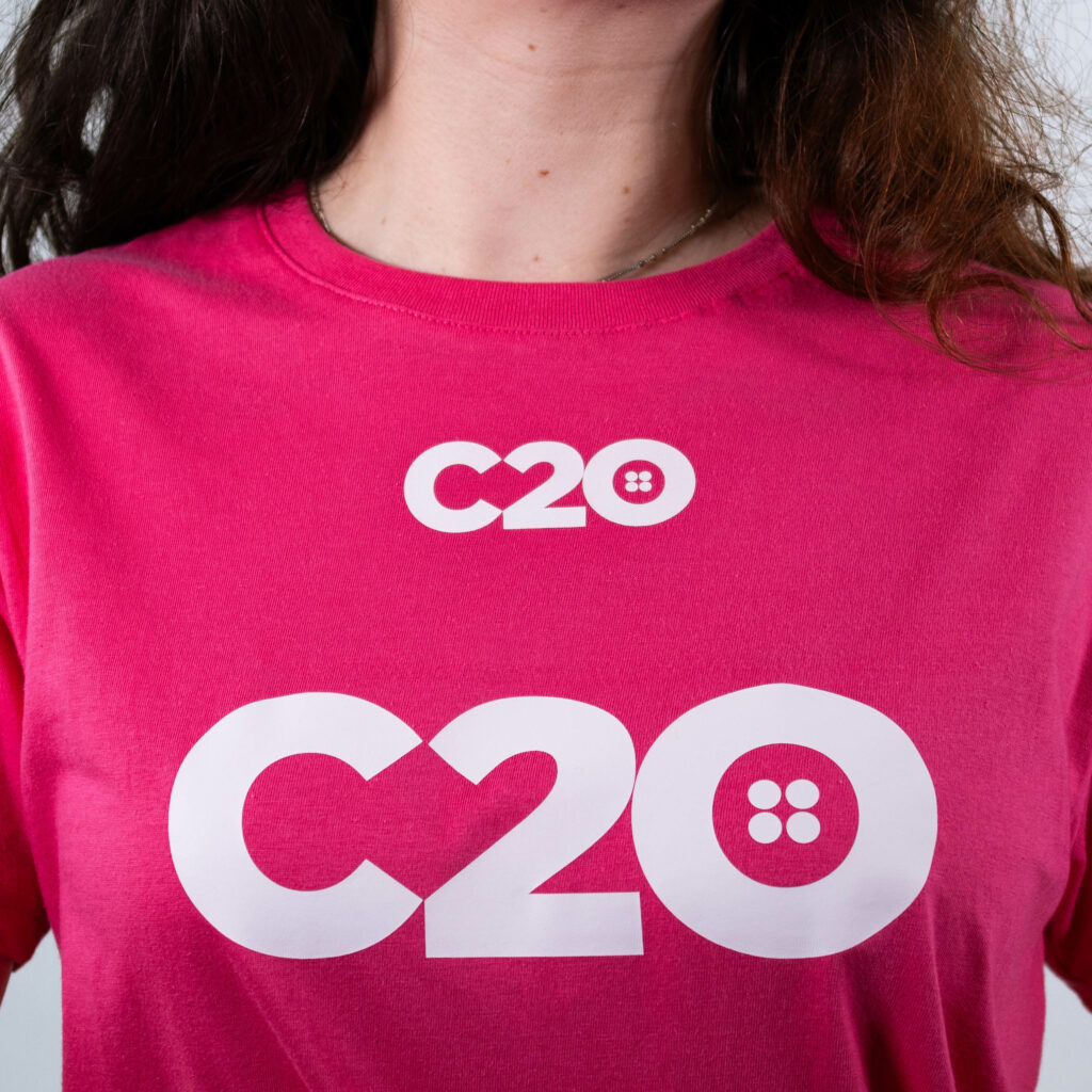
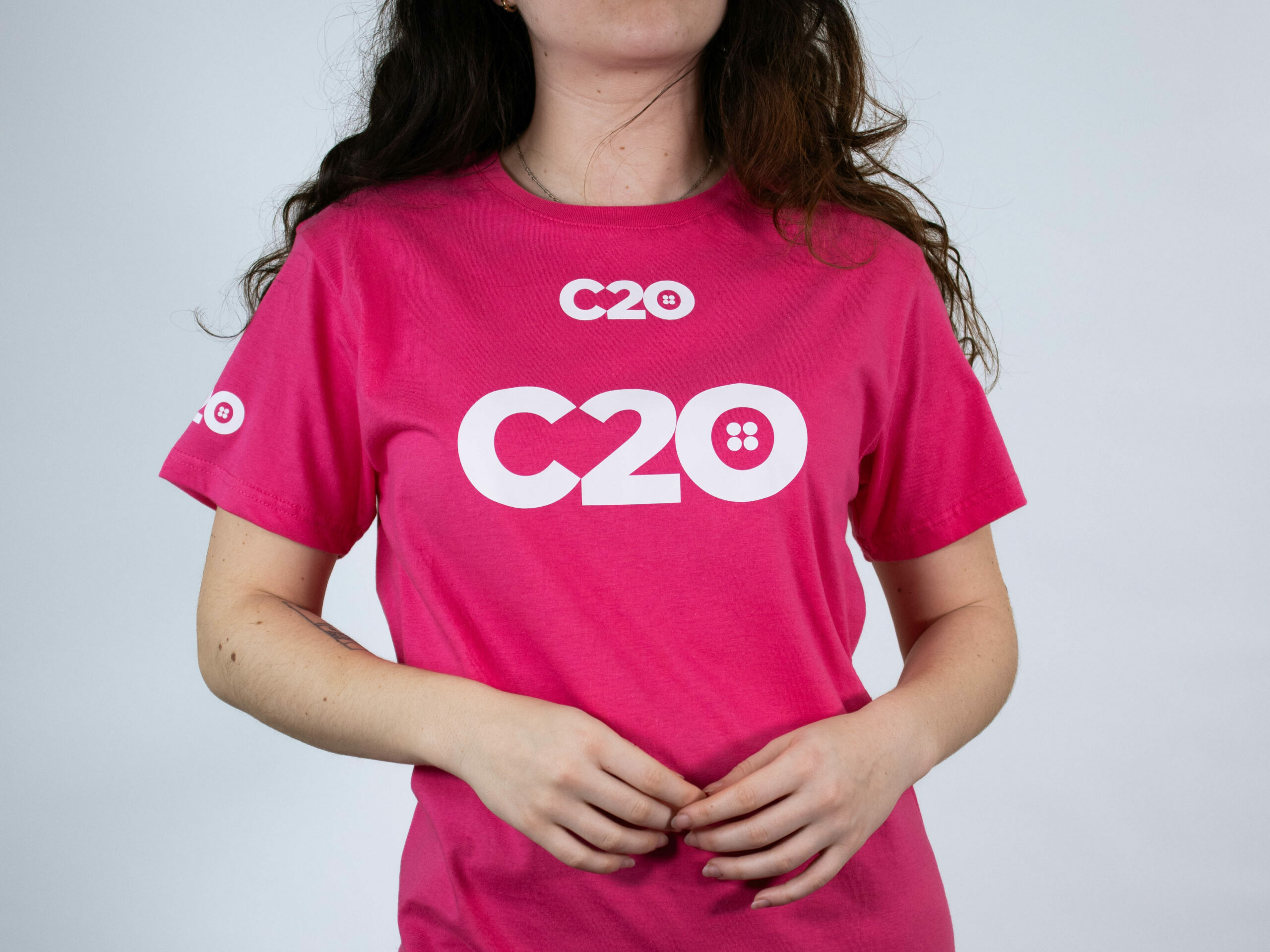
Although consistency can be great for branding, visibility is perhaps even more essential. The top chest position is ideal for teams that tend to layer up, as it allows the wearer to continue showing off their logo on a t-shirt or sweater while wearing something warmer as well.
It’s also perfect for staying on brand from anywhere, as top chest logos remain visible during Zoom and Teams calls.
This is actually where we’ve placed our own company logo for all our inner layers, while our outers are branded on the left chest position. This way, we can be certain that our branding is always in sight while in action or on the go.
Centre Chest Logo Placement
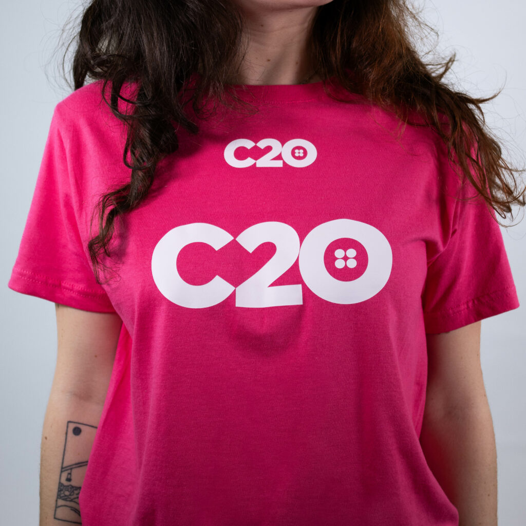
Sitting perfectly on the midpoint of the torso, centre chest is ideal for making the biggest impact, literally. The position lends itself to larger designs, and with more space often comes more detail (and colour).
We usually see this placement used for fan merchandise, events, and groups.
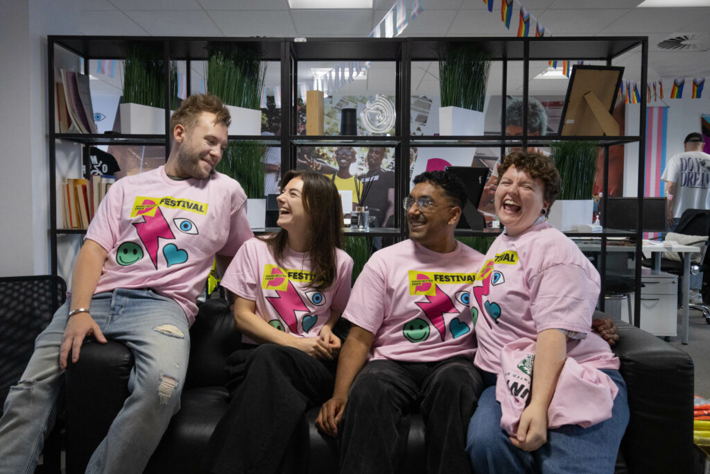
So if you’ve got a big, bright logo that demands maximum visibility, this is the placement for you.
Bottom Right & Left Logo Placements
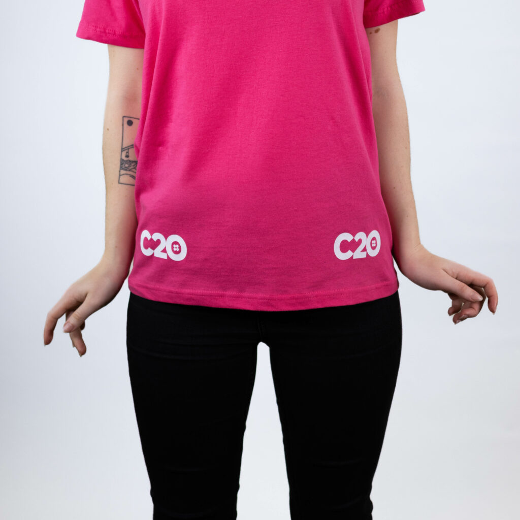
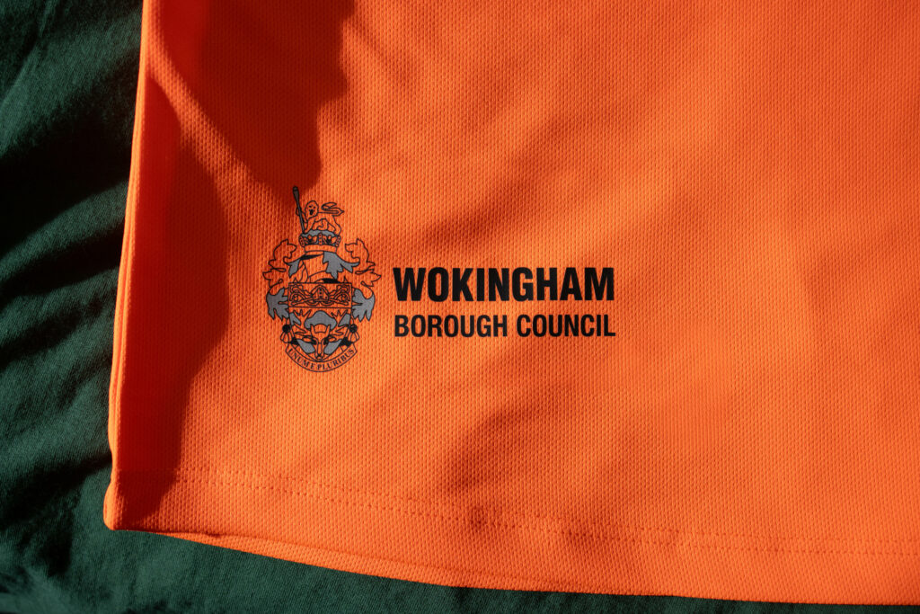
The bottom right and left positions sit right above the hem of the garment. These placements are typically employed for a more subtle look, featuring simpler and smaller designs while remaining on brand.
BACK OF GARMENT
Top Back Logo Placement
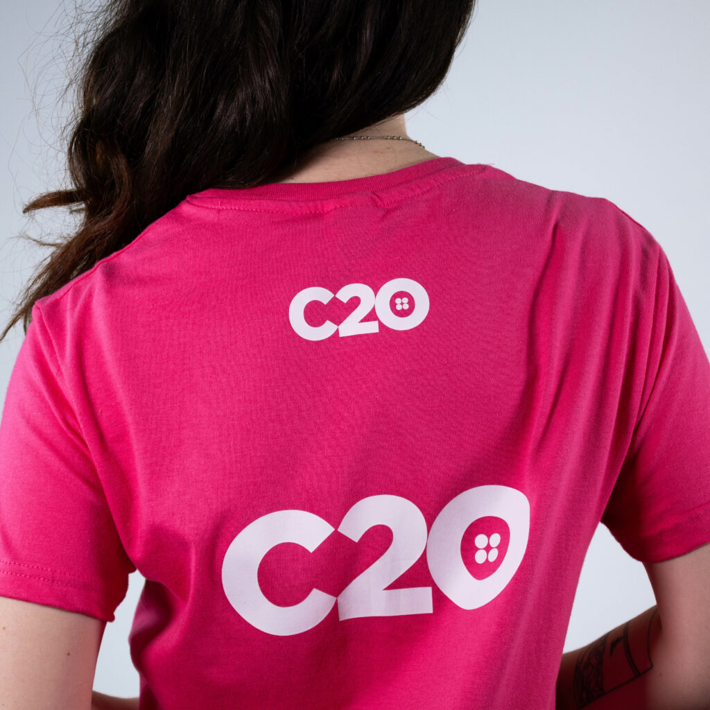
Top back is often used in a similar manner to bottom left and right, lending itself best to minimalistic logos and short text, such as names.
So, if you’re looking for a more understated approach, this might be the choice for you.
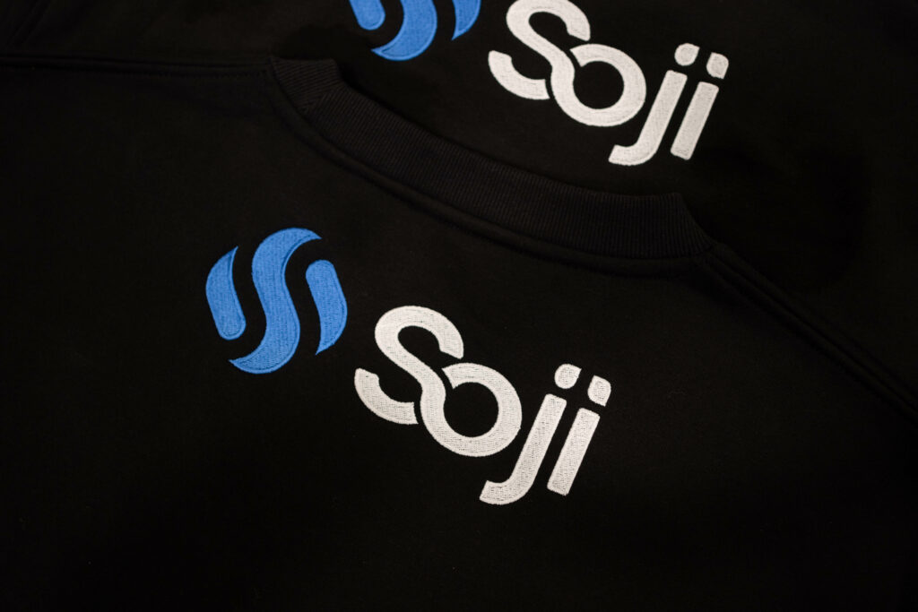
Although we are able to print and embroider designs as wide as 30cm in this position, its proximity to the neckline means smaller logos (12-15cm) tend to look more fitting.
Centre Back Logo Placement
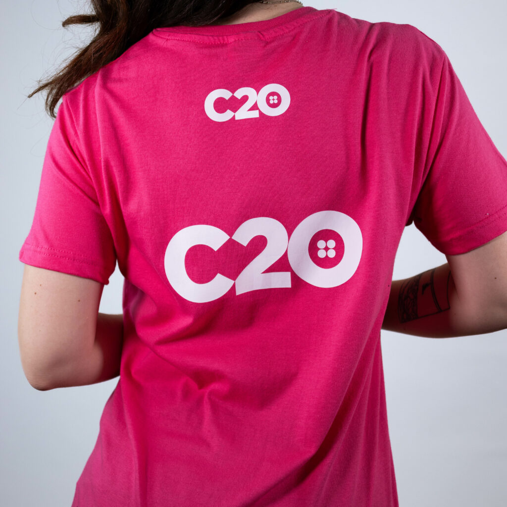
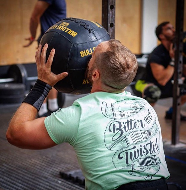
Centre back is another excellent position for big, bold designs. You would typically use this one of two ways.
Either: showing off detailed artwork (whether for organisations, teams, or fashion brands)…
Or clearly displaying pertinent information (usually in a larger text format).
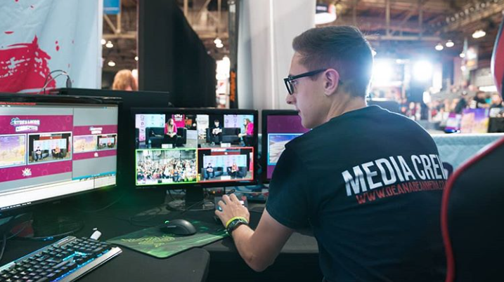
No matter the type of logo, it’s bound to grab attention when spread across the back of one’s torso in this manner.
Bottom Back Logo Placement
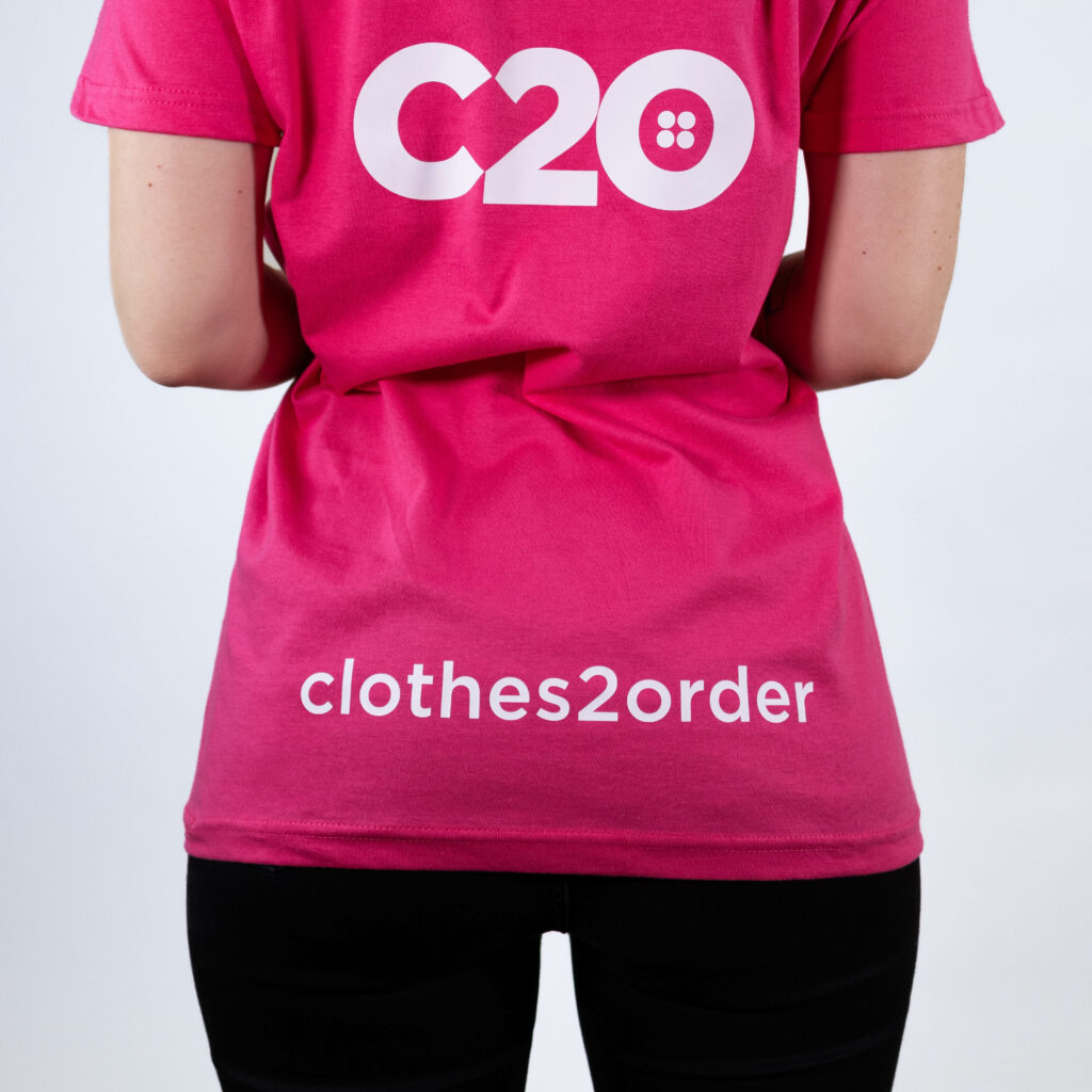
With its width and less-central placement, our bottom back position is perfect for straplines, URLs, and other useful text-based logos.
It also allows room for your more artistic designs to be featured above (for example, in the centre back position).
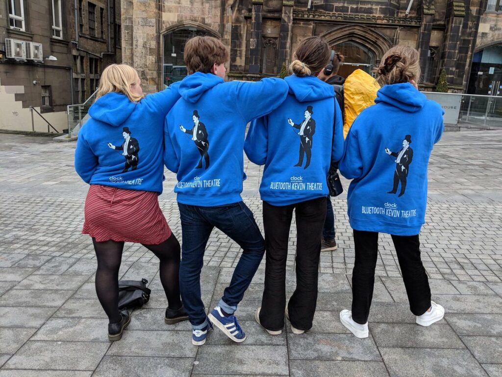
Shoulder Blades Logo Placement
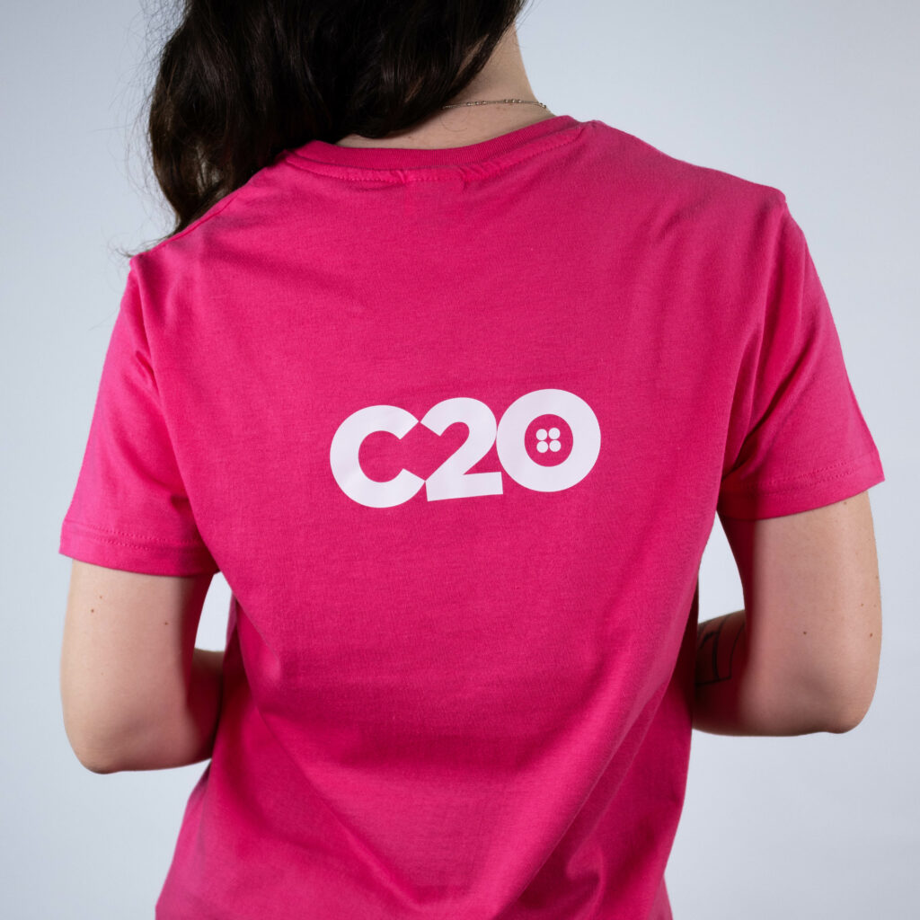
Shoulder blades is the newest placement we’ve made available on our customisation tool. It allows for a nice little middle-ground between top and centre back, and can be used like either of the two.
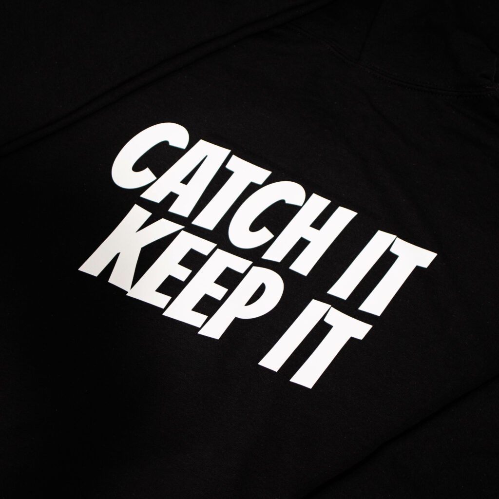
Intrigued? Go ahead and play around on our site to see if this new position is the one for you!
GARMENT SLEEVES
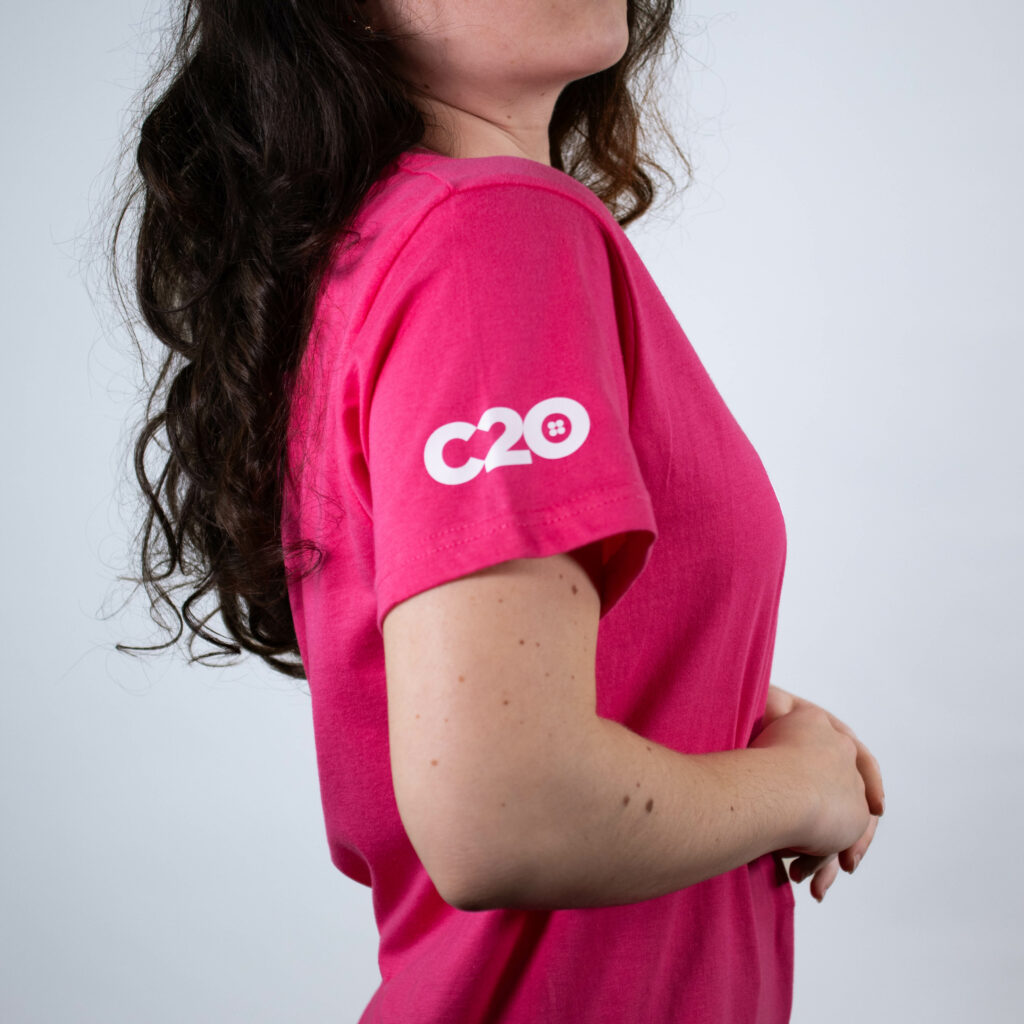
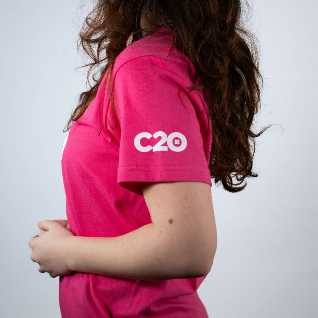
And lastly, we also offer sleeve customisations. These, as you can probably guess, are available on the right and left as well.
Right & Left Right Sleeve Logo Placements
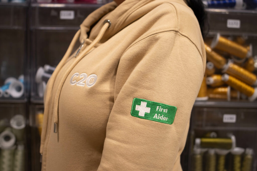
The right and left sleeve are great spots for alternative logos or any additional information the wearer needs to declare, such as their rank or some form of qualification.
Our staff members with physical and mental first aid training, as well as our fire marshals, are all clearly identifiable by the their brightly-coloured sleeve additions.
And that’s it for the standard logo positions we currently offer on our t-shirts. But if you have any further questions, don’t hesitate to get in touch with our team.
If you’re happy to just play around and see what works, however, feel free to use the customisation preview tool on our website once your items are in the basket.
Either way, now that you know how each position looks, it’s up to you to add your logo or artwork and make your next order truly unique.
Happy shopping!
